CSS Unleashed : Transform Your Websites with Advanced Styling Techniques
Table of Contents
CSS plays a crucial role in web development, collaborating with HTML and JavaScript. While HTML establishes the structure and JavaScript enables interactivity, CSS is in charge of the visual design of a website. This extensive manual will encompass all aspects of CSS, from the fundamentals to advanced methods, optimal approaches, and upcoming developments.
1 . Introduction to CSS
What is CSS?
CSS stands for Cascading Style Sheets. It is a language for styling used to define the appearance of a document written in HTML or XML. It defines how elements should be rendered on screen, on paper, or in other media.
Why is CSS Important?
CSS is essential for several reasons:
- Separation of Concerns: It separates content (HTML) from presentation (CSS), making maintenance easier.
- Consistency: CSS ensures a consistent look and feel across all pages of a website.
- Accessibility: Proper use of CSS can improve accessibility for users with disabilities.
- Performance: Efficient CSS can improve the loading times and performance of a website.
2. Basic Concepts and Syntax
CSS Syntax
A CSS rule is comprised of a selector and a declaration block:
selector {
  property: value;
}
- Selector: Identifies the HTML element(s) that you wish to customize.
- Property: Specifies the aspect of the element you want to change (e.g., color, font-size).
- Value: Defines the value of the property (e.g., blue, 16px).
Types of CSS Selectors
- Element Selector: Targets HTML elements directly. Example:
p { color: blue; } - Class Selector: Selects elements based on a particular class attribute. Example:
.example { color: blue; } - ID Selector: Selects a particular element by its unique ID. Example:
#example { color: blue; } - Attribute Selector: Targets elements based on attributes. Example:
[type="text"] { color: blue; } - Pseudo-class Selector: Targets elements based on their state. Example:
a:hover { color: blue; } - Pseudo-element Selector: Targets parts of elements. Example:
p::first-line { color: blue; }
3. Styling Text and Fonts
Text Properties
- color: Sets the color of text.
- font-family: Specifies the font for text.
- font-size: Sets the size of text.
- font-weight: Controls the boldness of text.
- line-height: Sets the space between lines of text.
- text-align: Aligns text horizontally (left, right, center, justify).
- text-decoration: Adds decorations like underline, overline, and line-through.
Example:
body {
  font-family: Arial, sans-serif;
  color: #333;
  line-height: 1.6;
}

h1 {
  font-size: 2em;
  font-weight: bold;
  text-align: center;
  text-decoration: underline;
}
4. CSS Box Model
Understanding the Box Model
Every element in it is considered a rectangular box. The box model consists of:
- Content: The present substance of the element (text, images).
- Padding: Space between the content and the border.
- Border: A border encircling the padding (if applicable) and content.
- Margin: Space outside the border.
Example:
div {
  width: 200px;
  padding: 20px;
  border: 2px solid #000;
  margin: 10px;
}
Box-Sizing
The box-sizing property controls how the total width and height of an element are calculated:
- content-box: (default) Width and height include only the content.
- border-box: The dimensions of an element encompass its content, padding, and border.
.box {
  box-sizing: border-box;
}
5. Layout Techniques
Display Property
- block: The element is displayed as a block (e.g.,
div). - inline: The element is displayed as an inline element (e.g.,
span). - inline-block: The element is displayed as an inline-level block container.
- none: The element is not displayed.
.block {
  display: block;
}

.inline {
  display: inline;
}
Position Property
- static: (default) Normal flow of the document.
- relative: Positioned relative to its normal position.
- absolute: Positioned relative to the nearest positioned ancestor.
- fixed: Positioned relative to the viewport.
- sticky: Switches between relative and fixed, depending on the scroll position.
.relative {
  position: relative;
  top: 10px;
  left: 10px;
}

.absolute {
  position: absolute;
  top: 50px;
  left: 50px;
}
Flexbox
Flexbox is a layout model that allows for the creation of responsive layouts.
.container {
  display: flex;
  justify-content: center;
  align-items: center;
}

.item {
  flex: 1;
}
Grid
Cascading style sheet Grid Layout is a two-dimensional layout system.
.container {
  display: grid;
  grid-template-columns: repeat(3, 1fr);
  grid-gap: 10px;
}

.item {
  background-color: #ccc;
}
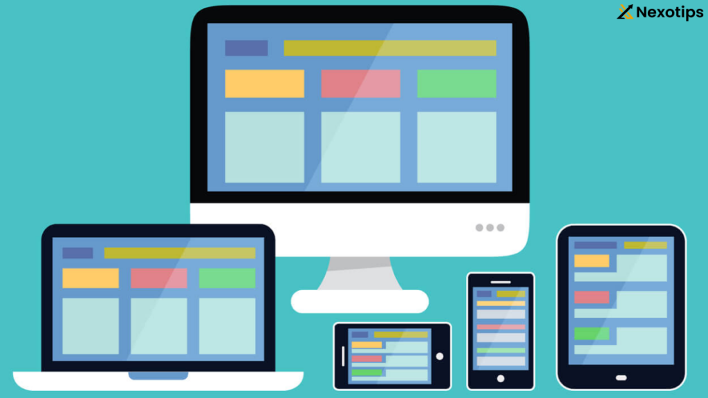
6. Responsive Design

Media Queries
Media queries allow you to apply it rules based on the viewport size.
@media (max-width: 600px) {
  .container {
    flex-direction: column;
  }
}
Flexible Units
- Percentage: Widths defined in percentages.
- Viewport Width (vw): 1vw is 1% of the viewport width.
- Viewport Height (vh): 1vh is 1% of the viewport height.
- em/rem: Relative units based on font size.
.container {
  width: 80%;
}

.text {
  font-size: 1.5rem;
}
Responsive Frameworks
Using frameworks like Bootstrap or Foundation can simplify the creation of responsive layouts.
<link rel="stylesheet" href="https://maxcdn.bootstrapcdn.com/bootstrap/4.0.0/css/bootstrap.min.css">

<div class="container">
  <div class="row">
    <div class="col-md-4">Column 1</div>
    <div class="col-md-4">Column 2</div>
    <div class="col-md-4">Column 3</div>
  </div>
</div>
7. Animations and Transitions
Transitions
Transitions provide a way to make changes to properties over a specified duration.
.box {
  background-color: blue;
  transition: background-color 0.5s;
}

.box:hover {
  background-color: red;
}
Keyframe Animations
Keyframes define the steps in an animation.
@keyframes example {
  from { background-color: blue; }
  to { background-color: red; }
}

.box {
  animation: example 5s infinite;
}
Cascading style sheet Animation Properties
- animation-name: Specifies the name of the @keyframes animation.
- animation-duration: Defines how long the animation lasts.
- animation-timing-function: Specifies the speed curve.
- animation-delay: Specifies a delay before the animation starts.
- animation-iteration-count: Specifies the number of times the animation should play.
.box {
  animation-name: example;
  animation-duration: 5s;
  animation-timing-function: ease-in-out;
  animation-delay: 1s;
  animation-iteration-count: infinite;
}
8. Cascading style sheet Frameworks and Preprocessors
Cascading style sheet Frameworks
Cascading style sheet frameworks provide pre-built classes and components to speed up development. Some popular frameworks include:
- Bootstrap: Provides a grid system, responsive design, and various UI components.
- Foundation: Offers similar features with a focus on accessibility and semantic HTML.
- Bulma: A modern it framework based on Flexbox.
Cascading style sheet Preprocessors
it’s preprocessors extend with variables, nested rules, and functions. Some popular preprocessors include:
- Sass (Syntactically Awesome Style Sheets): Uses
.scssor.sassfiles. - Less (Leaner Style Sheets): Uses
.lessfiles. - Stylus: Uses
.stylfiles.
Example of Sass:
$primary-color: #333;

body {
  font-family: Arial, sans-serif;
  color: $primary-color;
}

.container {
  padding: 20px;
  .header {
    font-size: 2em;
    color: darken($primary-color, 10%);
  }
}
Compiling Sass to Cascading style sheet
Sass needs to be compiled into it using a tool like the Sass command-line tool, a task runner (e.g., Gulp), or a build tool (e.g., Webpack).
bashCopy codesass styles.scss styles.css
9. Accessibility and Best Practices
Accessibility
Creating accessible websites ensures that all users, including those with disabilities, can access and interact with your content.
- Use Semantic HTML: Use HTML elements according to their purpose (e.g.,
<header>,<nav>,<main>,<footer>). - Ensure Readable Text: Use sufficient color contrast and readable font sizes.
- Keyboard Navigation: Ensure all interactive elements can be accessed via keyboard.
- ARIA (Accessible Rich Internet Applications): Use ARIA attributes to improve accessibility for users with assistive technologies.
button {
  background-color: #0066cc;
  color: #fff;
  padding: 10px;
  border: none;
  cursor: pointer;
}

button:focus {
  outline: 2px solid #ffcc00;
}
Best Practices
- Organize Your cascading style sheet: Use a logical structure, such as grouping styles by component or page section.
- Minimize Repetition: Use classes and reusable components to avoid redundancy.
- Optimize Performance: Minimize the use of large images, reduce HTTP requests, and use efficient it’s selectors.
- Keep It Maintainable: Use meaningful class names and comments to improve readability and maintainability.
10. Advanced Techniques
Cascading style sheet Variables
Cascading style sheet variables, also known as custom properties, allow you to store values and reuse them throughout it.
:root {
  --primary-color: #333;
  --secondary-color: #0066cc;
}

body {
  color: var(--primary-color);
}

a {
  color: var(--secondary-color);
}
Cascading style sheet Grid Advanced Techniques
Using named grid areas and grid templates for complex layouts.
.container {
  display: grid;
  grid-template-areas:
    "header header"
    "sidebar main"
    "footer footer";
  grid-template-rows: auto 1fr auto;
  grid-template-columns: 200px 1fr;
}

.header {
  grid-area: header;
}

.sidebar {
  grid-area: sidebar;
}

.main {
  grid-area: main;
}

.footer {
  grid-area: footer;
}
11. Future Trends and Conclusion
Future Trends in Cascading style sheet
- CSS Subgrid: Extends the grid layout to allow nested grids to align with their parent grid.
- Container Queries: Apply styles based on the size of a container rather than the viewport.
- CSS Custom Functions: Create reusable functions within it.
Conclusion
CSS is a powerful and versatile language that plays a crucial role in web design and development. By mastering the basics, exploring advanced techniques, and staying up-to-date with the latest trends, you can create beautiful, responsive, and accessible websites. Whether you are a beginner or an experienced developer, there is always something new to learn and explore in the world of CSS.
Read More : HTML Links Unleashed : Best Practices for Developers
