


Angular Material Autocomplete, Button, and Card Components
Angular Material is a popular UI component library for building modern, responsive, and accessible web applications with Angular. It provides a set of high-quality components and directives that follow Google’s Material Design guidelines. In this blog post, we will focus on three commonly used components: Autocomplete, Button, and Card.

Angular Material Autocomplete
The Autocomplete component in Angular Material provides a way to suggest and select options from a list as the user types. It is often used in search bars, address forms, or any scenario where you want to provide suggestions to the user.
Use Cases for Autocomplete
- Search Functionality: Autocomplete can enhance the search experience by providing relevant suggestions as the user types, reducing the time and effort required to find desired results.
- Address Forms: When filling out address forms, autocomplete can suggest and complete addresses based on partial input, making the process faster and more accurate.
- Tagging Systems: In applications that allow users to add tags or labels, autocomplete can suggest relevant tags based on the user’s input, promoting consistency and reducing typing effort.
- Lookup Tables: Autocomplete can be used to provide suggestions for lookup tables, such as country names, product codes, or any other data that needs to be selected from a predefined list.
How to Use Autocomplete
To use the Autocomplete component in your Angular Material application, follow these steps:
- Import the
MatAutocompleteModulein your module file. - Create an array of options that you want to suggest to the user.
- Use the
<mat-autocomplete>and<input>elements in your template, and bind them to the appropriate form control. - Customize the appearance and behavior of the autocomplete using various input properties and event bindings.
Here’s a simple example of how to use Autocomplete:
<mat-form-field>
  <input matInput placeholder="Enter a fruit" [matAutocomplete]="auto" [formControl]="fruitControl">
</mat-form-field>

<mat-autocomplete #auto="matAutocomplete">
  <mat-option *ngFor="let fruit of filteredFruits$ | async" [value]="fruit">
    {{ fruit }}
  </mat-option>
</mat-autocomplete>
import { Component } from '@angular/core';
import { FormControl } from '@angular/forms';
import { Observable } from 'rxjs';
import { map, startWith } from 'rxjs/operators';
@Component({
selector: 'app-autocomplete-example',
templateUrl: './autocomplete-example.component.html',
styleUrls: ['./autocomplete-example.component.css']
})
export class AutocompleteExampleComponent {
fruitControl = new FormControl('');
fruits: string[] = ['Apple', 'Banana', 'Cherry', 'Durian', 'Elderberry'];
filteredFruits$: Observable<string[]>;
constructor() {
this.filteredFruits$ = this.fruitControl.valueChanges.pipe(
startWith(''),
map(value => this._filter(value))
);
}
private _filter(value: string): string[] {
const filterValue = value.toLowerCase();
return this.fruits.filter(fruit => fruit.toLowerCase().includes(filterValue));
}
}In this example, as the user types in the input field, the filteredFruits$ observable emits an array of filtered fruits based on the user’s input. The <mat-autocomplete> component displays the filtered options, and when the user selects an option, it is automatically populated in the input field.
Angular Material Button
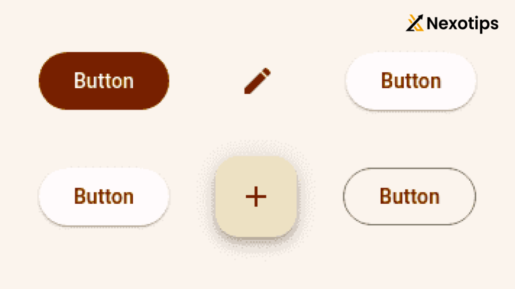
The Button component in Angular Material provides a set of customizable buttons that follow the Material Design guidelines. It offers different types of buttons, such as flat, raised, stroked, and icon buttons, to suit various design needs.
Use Cases for Button
- Primary Actions: Buttons are commonly used for primary actions, such as submitting forms, saving changes, or initiating a process.
- Secondary Actions: Buttons can also be used for secondary actions, such as canceling an operation, opening a dialog, or navigating to a different page.
- Toolbar Actions: Buttons are often used in toolbars or navigation menus to provide quick access to frequently used actions or features.
- Floating Action Buttons (FABs): Angular Material provides a special type of button called a Floating Action Button, which is typically used for the most important action on a screen.
How to Use Button
To use the Button component in your Angular Material application, follow these steps:
- Import the
MatButtonModulein your module file. - Use the
<button mat-button>element in your template to create a button. - Customize the button type using the
typeattribute (e.g.,type="submit"for form submission). - Apply different button styles using the appropriate directive (e.g.,
mat-flat-button,mat-raised-button,mat-stroked-button,mat-icon-button). - Use the
colorinput property to set the button color (e.g.,color="primary",color="accent",color="warn").
Here’s a simple example of how to use Buttons:
<button mat-raised-button color="primary">Primary Button</button>
<button mat-flat-button color="accent">Accent Button</button>
<button mat-stroked-button color="warn">Warn Button</button>
<button mat-icon-button color="primary">
  <mat-icon>favorite</mat-icon>
</button>
In this example, we create four different types of buttons: a raised button with a primary color, a flat button with an accent color, a stroked button with a warn color, and an icon button with a primary color. The <mat-icon> component is used to display an icon inside the icon button.
Angular Material Card
The Card component in Angular Material provides a container for displaying content in a consistent and organized manner. It is often used to present related information, such as product details, news articles, or user profiles.
Use Cases for Card
- Product Listings: Cards are commonly used to display product information, including images, titles, descriptions, and prices, in e-commerce applications.
- News and Blog Posts: Cards are suitable for presenting news articles or blog posts, with the ability to include images, titles, excerpts, and links to the full content.
- User Profiles: Cards can be used to showcase user profiles, displaying information such as profile pictures, names, bios, and social media links.
- Dashboard Widgets: In dashboard applications, cards can be used to present key metrics, charts, or other important information in a compact and organized manner.
How to Use Card
To use the Card component in your Angular Material application, follow these steps:
- Import the
MatCardModulein your module file. - Use the
<mat-card>element as the main container for your card content. - Inside the
<mat-card>, use elements like<mat-card-header>,<mat-card-content>,<mat-card-actions>, and<mat-card-footer>to structure your card content. - Customize the card appearance using various input properties and classes.
Here’s a simple example of how to use Cards:
<mat-card>
  <mat-card-header>
    <div mat-card-avatar class="example-header-image"></div>
    <mat-card-title>Shiba Inu</mat-card-title>
    <mat-card-subtitle>Dog Breed</mat-card-subtitle>
  </mat-card-header>
  <img mat-card-image src="https://material.angular.io/assets/img/examples/shiba2.jpg" alt="Photo of a Shiba Inu">
  <mat-card-content>
    <p>
      The Shiba Inu is the smallest of the six original and distinct spitz breeds of dog from Japan.
      A small, agile dog that copes very well with mountainous terrain, the Shiba Inu was originally
      bred for hunting.
    </p>
  </mat-card-content>
  <mat-card-actions>
    <button mat-button>LIKE</button>
    <button mat-button>SHARE</button>
  </mat-card-actions>
</mat-card>
In this example, we create a card with a header, an image, content, and actions. The header includes an avatar image, a title, and a subtitle. The <img mat-card-image> element is used to display the main image of the card. The content section contains a description of the Shiba Inu breed. Finally, the actions section includes two buttons: “LIKE” and “SHARE”.
Benefits of Using Angular Material Components
- Consistent User Experience: Angular Material components follow Google’s Material Design guidelines, ensuring a consistent and familiar user experience across your application.
- Responsive Design: Angular Material components are designed to be responsive and adapt to different screen sizes and devices, making it easier to create mobile-friendly applications.
- Accessibility: Angular Material components are built with accessibility in mind, providing features like keyboard navigation, screen reader support, and high-contrast modes.
- Customization: While Angular Material provides a set of pre-designed components, you can easily customize their appearance and behavior to match your application’s branding and design requirements.
- Performance: Angular Material components are optimized for performance, using techniques like lazy loading and virtual scrolling to ensure smooth rendering and fast load times.
- Community Support: Angular Material has a large and active community of developers, providing a wealth of resources, examples, and support through forums, documentation, and third-party libraries.
Simple Programs Using Angular Material Components
Here’s a simple program that demonstrates the usage of Autocomplete, Button, and Card components:
<mat-form-field>
  <input matInput placeholder="Enter a fruit" [matAutocomplete]="auto" [formControl]="fruitControl">
</mat-form-field>

<mat-autocomplete #auto="matAutocomplete">
  <mat-option *ngFor="let fruit of filteredFruits$ | async" [value]="fruit">
    {{ fruit }}
  </mat-option>
</mat-autocomplete>

<mat-card>
  <mat-card-header>
    <div mat-card-avatar class="example-header-image"></div>
    <mat-card-title>Shiba Inu</mat-card-title>
    <mat-card-subtitle>Dog Breed</mat-card-subtitle>
  </mat-card-header>
  <img mat-card-image src="https://material.angular.io/assets/img/examples/shiba2.jpg" alt="Photo of a Shiba Inu">
  <mat-card-content>
    <p>
      The Shiba Inu is the smallest of the six original and distinct spitz breeds of dog from Japan.
      A small, agile dog that copes very well with mountainous terrain, the Shiba Inu was originally
      bred for hunting.
    </p>
  </mat-card-content>
  <mat-card-actions>
    <button mat-raised-button color="primary">LIKE</button>
    <button mat-flat-button color="accent">SHARE</button>
  </mat-card-actions>
</mat-card>
import { Component } from '@angular/core';
import { FormControl } from '@angular/forms';
import { Observable } from 'rxjs';
import { map, startWith } from 'rxjs/operators';
@Component({
selector: 'app-example',
templateUrl: './example.component.html',
styleUrls: ['./example.component.css']
})
export class ExampleComponent {
fruitControl = new FormControl('');
fruits: string[] = ['Apple', 'Banana', 'Cherry', 'Durian', 'Elderberry'];
filteredFruits$: Observable<string[]>;
constructor() {
this.filteredFruits$ = this.fruitControl.valueChanges.pipe(
startWith(''),
map(value => this._filter(value))
);
}
private _filter(value: string): string[] {
const filterValue = value.toLowerCase();
return this.fruits.filter(fruit => fruit.toLowerCase().includes(filterValue));
}
}In this example, we combine the usage of Autocomplete, Button, and Card components:
- The Autocomplete component allows the user to enter a fruit and displays suggestions based on the input.
- The Card component displays information about a Shiba Inu breed, including an image, title, subtitle, content, and two buttons.
- The Button components are used inside the Card actions section, with a raised primary button for “LIKE” and a flat accent button for “SHARE”.
By combining these components, we create a simple yet engaging user interface that demonstrates the flexibility and power of Angular Material in building modern web applications.
Angular Material provides a comprehensive set of UI components that simplify the development of responsive and accessible web applications. The Autocomplete, Button, and Card components discussed in this blog post are just a few examples of the many components available in Angular Material.
By leveraging these components, you can quickly build user interfaces that follow best practices and provide a consistent user experience. Angular Material’s customization options and community support make it an excellent choice for Angular developers looking to create high-quality applications with minimal effort.