Style Mastery In 2024 : Elevate Your Web Design Skills with Advanced HTML Techniques
Style to html element using the Css property. HTML, also known as Hypertext Markup Language, serves as the standard language for developing and organizing web pages. Through the use of tags, it establishes the structure and content of a webpage, whereas CSS is employed to design and arrange the content.
The Role of CSS in Web Design
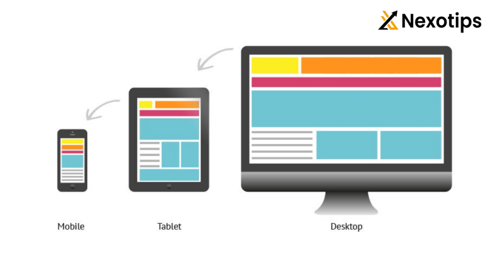
CSS (Cascading Style Sheets) is a stylesheet language that describes the presentation of an HTML document. It enables web designers and developers to control the appearance, layout, and formatting of web pages across different devices and screen sizes.
Basic Structure of an HTML Document
Every HTML document begins with a <!DOCTYPE html> declaration, followed by the <html>, <head>, and <body> tags:
<!DOCTYPE html>
<html lang="en">
<head>
<meta charset="UTF-8">
<meta name="viewport" content="width=device-width, initial-scale=1.0">
<title>Your Page Title</title>
<link rel="stylesheet" href="styles.css">
</head>
<body>
<header>
<h1>Welcome to My Website</h1>
</header>
<nav>
<ul>
<li><a href="#">Home</a></li>
<li><a href="#">About</a></li>
<li><a href="#">Services</a></li>
<li><a href="#">Contact</a></li>
</ul>
</nav>
<section>
<h2>Section Title</h2>
<p>This is the content of the section...</p>
</section>
<footer>
<p>© 2024 Your Website. All rights reserved.</p>
</footer>
</body>
</html>
Understanding CSS Basics
Syntax and Selectors
Cascading Style Sheets (CSS) utilizes selectors to pinpoint specific HTML elements and implement various styles. Selectors can be based on element type, class, ID, attributes, or pseudo-classes:
/* Selecting by element type */
h1 {
    color: #333;
    font-size: 2em;
}

/* Selecting by class */
.section-title {
    font-weight: bold;
}

/* Selecting by ID */
#footer {
    background-color: #f0f0f0;
}
Applying Styles with Properties and Values
CSS properties define how HTML elements are displayed. They include properties for typography, color, layout, and more:
body {
    font-family: Arial, sans-serif;
    line-height: 1.6;
}

.section {
    padding: 20px;
    border: 1px solid #ccc;
    margin-bottom: 20px;
}
Inline, Internal, and External CSS
CSS can be applied inline within HTML elements, internally within <style> tags in the <head> section of an HTML document, or externally in separate .css files linked to the HTML document:
<!-- Inline CSS -->
<p style="color: red; font-size: 18px;">Inline styled text.</p>

<!-- Internal CSS -->
<style>
    body {
        background-color: #f0f0f0;
    }
    h1 {
        color: #333;
        text-align: center;
    }
</style>

<!-- External CSS -->
<link rel="stylesheet" href="styles.css">
Box Model and Layout
Box Model Fundamentals
The CSS box model explains the rectangular boxes that enclose each HTML element. It consists of content, padding, border, and margin:
.box {
    width: 300px;
    height: 200px;
    padding: 20px;
    border: 1px solid #ccc;
    margin: 20px;
}
Margin, Padding, and Border
- Margin: Space outside the border of an element.
- Padding: Space between the content and the border of an element.
- Border: Border around the padding and content of an element.
.box {
    padding: 20px;
    border: 1px solid #ccc;
    margin: 20px;
}
Creating Layouts with CSS
CSS provides several techniques for creating layouts, including floats, positioning, flexbox, and grid layout. Flexbox and grid layout are modern techniques that offer powerful tools for creating complex and responsive layouts:
/* Flexbox Example */
.container {
    display: flex;
    justify-content: space-between;
    align-items: center;
}

/* Grid Layout Example */
.container {
    display: grid;
    grid-template-columns: 1fr 2fr;
    gap: 20px;
}
Typography and Fonts
Choosing Web Fonts
Web fonts allow designers to use custom fonts that aren’t universally available on all devices. Use @font-face to specify custom fonts in CSS:
@font-face {
    font-family: 'YourFontName';
    src: url('your-font.woff2') format('woff2'),
         url('your-font.woff') format('woff');
    font-weight: normal;
    font-style: normal;
}

body {
    font-family: 'YourFontName', Arial, sans-serif;
}
Text Properties: Size, Color, Alignment
CSS provides properties to control text appearance, including font size, color, alignment, and spacing:
body {
    font-size: 16px;
    color: #333;
    text-align: left;
    line-height: 1.6;
}
Responsive Typography
Responsive typography ensures text remains readable and visually appealing across different devices and screen sizes. Use relative units (em, rem, %) for responsive typography:
body {
    font-size: 16px;
}

@media screen and (max-width: 768px) {
    body {
        font-size: 14px;
    }
}
Color and Backgrounds
Color Theory Basics
Understanding color theory helps in choosing harmonious color schemes for your website. Use color wheel principles for selecting colors:
body {
    background-color: #f0f0f0;
    color: #333;
}

.section {
    background-color: #fff;
}
Applying Colors with CSS
CSS supports a variety of color formats, including named colors, hexadecimal, RGB, RGBA, HSL, and HSLA:
.section {
    background-color: #f0f0f0; /* Hexadecimal */
    color: rgb(51, 51, 51); /* RGB */
}

.button {
    background-color: hsl(210, 50%, 50%); /* HSL */
}
Working with Gradients and Images for Backgrounds
CSS gradients allow you to create smooth transitions between colors. Use linear-gradient() or radial-gradient() for background effects:
.background {
    background: linear-gradient(to right, #ffcc00, #ff9900);
}

.header {
    background: url('header-bg.jpg') center/cover no-repeat;
}
CSS Flexbox and Grid
Flexbox for Flexible Layouts
Flexbox is a one-dimensional layout model that allows you to create flexible and responsive layouts:
.container {
    display: flex;
    justify-content: space-between;
    align-items: center;
}

.item {
    flex: 1;
}
Grid for Complex Grid-Based Layouts
The CSS Grid Layout is a system for creating grid-based layouts in two dimensions:
.container {
    display: grid;
    grid-template-columns: 1fr 2fr;
    grid-gap: 20px;
}
Practical Examples and Use Cases
.container {
    display: grid;
    grid-template-columns: repeat(auto-fit, minmax(200px, 1fr));
    grid-gap: 20px;
}
Responsive Design Techniques
Media Queries for Responsiveness
Media queries allow you to apply CSS based on the characteristics of the device being used:
@media screen and (max-width: 768px) {
    .container {
        display: block;
    }
}

Mobile-First Design Approach
Start designing for mobile devices first, then use media queries to add styles for larger screens:
/* Base styles for mobile */
.container {
    padding: 20px;
}

/* Media query for tablets and desktops */
@media screen and (min-width: 768px) {
    .container {
        padding: 40px;
    }
}
Designing for Multiple Devices and Screen Sizes
Test your designs across different devices and screen sizes to ensure they look good and function well on all devices:
/* Tablet landscape */
@media screen and (min-width: 768px) and (max-width: 1024px) {
    .container {
        width: 90%;
    }
}

/* Desktop */
@media screen and (min-width: 1025px) {
    .container {
        width: 80%;
    }
}
CSS Frameworks and Libraries
Introduction to Bootstrap, Foundation, and Other Frameworks
CSS frameworks like Bootstrap and Foundation provide pre-built components and stylesheets that make it easier to create responsive and visually appealing websites:
<link rel="stylesheet" href="https://stackpath.bootstrapcdn.com/bootstrap/4.5.2/css/bootstrap.min.css">
Pros and Cons of Using CSS Frameworks
- Pros: Rapid development, consistent design, responsive layout out-of-the-box.
- Cons: Large file size, limited customization, learning curve for advanced customization.
Customizing and Extending Frameworks
Frameworks often provide customization options via variables or custom stylesheets. Use these to tailor the framework to your project’s needs:
$primary-color: #007bff; /* Bootstrap custom variable */
Animations and Transitions
CSS Animations
CSS animations allow you to create movement and effects on elements without JavaScript:
@keyframes slidein {
    from {
        transform: translateX(-100%);
    }
    to {
        transform: translateX(0);
    }
}

.element {
    animation: slidein 1s forwards;
}
Transition Effects for Smooth Interface Changes
CSS transitions enable smooth transitions between property changes:
.button {
    background-color: #007bff;
    transition: background-color 0.3s ease;
}

.button:hover {
    background-color: #0056b3;
}
Best Practices for Using Animations
- Performance: Optimize animations for smooth performance.
- Subtlety: Keep animations subtle to enhance user experience.
- Accessibility: Consider users who may prefer reduced motion.
Advanced CSS Techniques
CSS Preprocessors (e.g., Sass, LESS)
CSS preprocessors extend CSS with variables, nesting, functions, and more:
$primary-color: #007bff;

.element {
    color: $primary-color;
}
CSS Variables (Custom Properties)
CSS variables (custom properties) allow you to define reusable values in CSS:
:root {
    --primary-color: #007bff;
}

.element {
    color: var(--primary-color);
}
Modern CSS Features (e.g., Grid Layout, Flexbox)
Modern CSS features like Grid Layout and Flexbox offer powerful tools for creating complex and responsive layouts:
.container {
    display: grid;
    grid-template-columns: 1fr 2fr;
    gap: 20px;
}
Accessibility and SEO Considerations
Creating Accessible Designs with CSS
Use CSS to enhance accessibility by ensuring content is readable and navigable:
.element {
    outline: none;
}

.element:focus {
    box-shadow: 0 0 0 3px rgba(0, 123, 255, 0.5);
}
Semantic HTML and CSS
Use semantic HTML elements and CSS to improve the accessibility and structure of your content:
<header>
    <nav>
        <ul>
            <li><a href="#">Home</a></li>
            <li><a href="#">About</a></li>
        </ul>
    </nav>
</header>
SEO-Friendly CSS Practices
CSS can impact SEO indirectly by improving user experience and page load times:
body {
    font-family: Arial, sans-serif;
    line-height: 1.6;
}
Debugging and Performance Optimization
Debugging CSS with Browser Developer Tools
Use browser developer tools to inspect and debug CSS:
.element {
    background-color: #007bff;
}
Optimizing CSS for Performance
Optimize CSS for performance by minifying, compressing, and reducing redundancy:
/* Before optimization */
.element {
    background-color: #007bff;
}

/* After optimization */
.element{background-color:#007bff;}
CSS File Minification and Compression
Use tools and plugins to automatically minify and compress CSS files for production:
<link rel="stylesheet" href="styles.min.css">
Best Practices and Tips
Writing Clean and Maintainable CSS Code
Follow best practices to write clean, readable, and maintainable CSS code:
/* Bad practice */
.container .content .header h1 {
    font-size: 24px;
}

/* Good practice */
.page-title {
    font-size: 24px;
}
Cross-Browser Compatibility
Test your designs across different browsers to ensure consistent appearance and functionality:
/* Target specific browser prefixes */
.element {
    -webkit-border-radius: 5px;
    -moz-border-radius: 5px;
    border-radius: 5px;
}
Version Control and CSS Architecture
Use version control (e.g., Git) to manage changes and collaborate on CSS files effectively:
/* Basic CSS architecture */
styles/
├── base/
│   ├── _reset.scss
│   └── _typography.scss
├── components/
│   ├── _buttons.scss
│   └── _forms.scss
└── main.scss
Conclusion
Mastering HTML styling is an essential skill for any web designer or developer looking to create visually appealing, responsive, and user-friendly websites. By understanding CSS fundamentals, advanced techniques, and best practices, you can elevate your web design skills and deliver compelling web experiences that engage and delight users across all devices and platforms. Whether you’re building a simple personal website or a complex web application, the principles and techniques covered in this guide will empower you to create polished and professional-looking designs. Keep experimenting, learning, and staying updated with the latest trends in HTML styling to continually improve your web design skills. Happy coding!
Read More : HTML Element and Attribute : Building Strong Foundations for Web Development
