


Introduction to Angular Material Grid-List
Angular Material provides a powerful grid-list component that allows you to create responsive, grid-based layouts in your Angular applications. The mat-grid-list component is the foundation of the grid layout, and it can be customized with various properties to achieve the desired layout.
What is Angular Material Grid-List?
The Angular Material Grid-List is a component that allows you to create a responsive, grid-based layout in your Angular application. It provides a flexible and easy-to-use way to organize content into a grid structure, with the ability to control the number of columns, row height, and tile spacing.


How to Use Angular Material Grid-List?
To use the Angular Material Grid-List, you need to first import the MatGridListModule in your Angular module:
import { MatGridListModule } from '@angular/material/grid-list';

@NgModule({
  imports: [
    // other modules
    MatGridListModule
  ],
  // ...
})
export class YourModule { }
Once you have imported the module, you can use the mat-grid-list component in your HTML template:
<mat-grid-list cols="4" rowHeight="100px" gutterSize="10px">
  <mat-grid-tile *ngFor="let tile of tiles" [colspan]="tile.cols" [rowspan]="tile.rows">
    {{ tile.text }}
  </mat-grid-tile>
</mat-grid-list>
In this example, we have a grid-list with 4 columns, a row height of 100 pixels, and a gutter size of 10 pixels. We then use the *ngFor directive to loop through an array of tiles and render them as individual grid tiles.
You can customize the grid-list by setting various properties, such as cols, rowHeight, gutterSize, colspan, and rowspan.
Advantages of Angular Material Grid-List
- Responsive Design: The Angular Material Grid-List is designed to be responsive, automatically adjusting the layout based on the screen size and device orientation.
- Flexible Layout: The grid-list component provides a flexible way to organize content, allowing you to control the number of columns, row height, and tile spacing.
- Easy to Use: The Angular Material Grid-List is easy to use and integrate into your Angular application, with a straightforward API and clear documentation.
- Consistent Styling: By using the Angular Material Grid-List, you can ensure that your grid-based layouts have a consistent look and feel with the rest of your Angular Material-based application.
Disadvantages of Angular Material Grid-List
- Limited Customization: While the Angular Material Grid-List is highly flexible, there may be some cases where you need more advanced customization options that are not provided out of the box.
- Performance Considerations: Depending on the complexity of your grid-based layout and the number of tiles, the Angular Material Grid-List may have some performance implications, especially on lower-end devices.
- Dependency on Angular Material: The Angular Material Grid-List is a part of the Angular Material library, so your application will have a dependency on this library, which may increase the overall bundle size.
Angular Material Side Nav
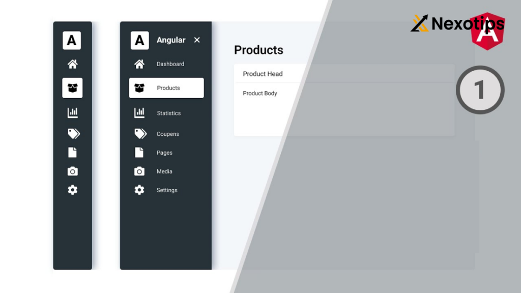
The Angular Material Side Nav is a component that allows you to create a collapsible side content area, often used for navigation, in your Angular application.
What is Angular Material Side Nav?
The Angular Material Side Nav is a set of components that provide a way to add collapsible side content to your Angular application. The main components are mat-sidenav-container, mat-sidenav-content, and mat-sidenav.
How to Use Angular Material Side Nav?
To use the Angular Material Side Nav, you need to first import the MatSidenavModule in your Angular module:
import { MatSidenavModule } from '@angular/material/sidenav';

@NgModule({
  imports: [
    // other modules
    MatSidenavModule
  ],
  // ...
})
export class YourModule { }
Once you have imported the module, you can use the mat-sidenav-container, mat-sidenav-content, and mat-sidenav components in your HTML template:
<mat-sidenav-container>
  <mat-sidenav #sidenav mode="over">
    <!-- Sidenav content goes here -->
  </mat-sidenav>

  <mat-sidenav-content>
    <!-- Main content goes here -->
  </mat-sidenav-content>
</mat-sidenav-container>
In this example, we have a mat-sidenav-container that wraps the entire layout. Inside the container, we have a mat-sidenav component that represents the side navigation, and a mat-sidenav-content component that represents the main content area.
You can customize the side nav by setting various properties, such as mode, position, and opened.
Advantages of Angular Material Side Nav
- Responsive Design: The Angular Material Side Nav is designed to be responsive, automatically adjusting the layout based on the screen size and device orientation.
- Flexible Layout: The side nav component provides a flexible way to organize content, allowing you to control the position, mode, and state of the side nav.
- Easy to Use: The Angular Material Side Nav is easy to use and integrate into your Angular application, with a straightforward API and clear documentation.
- Consistent Styling: By using the Angular Material Side Nav, you can ensure that your side navigation has a consistent look and feel with the rest of your Angular Material-based application.
Disadvantages of Angular Material Side Nav
- Limited Customization: While the Angular Material Side Nav is highly flexible, there may be some cases where you need more advanced customization options that are not provided out of the box.
- Performance Considerations: Depending on the complexity of your side navigation and the amount of content it contains, the Angular Material Side Nav may have some performance implications, especially on lower-end devices.
- Dependency on Angular Material: The Angular Material Side Nav is a part of the Angular Material library, so your application will have a dependency on this library, which may increase the overall bundle size.
Angular Material Navbar
The Angular Material Navbar is a component that allows you to create a responsive, material-design-inspired navigation bar in your Angular application.
What is Angular Material Navbar?
The Angular Material Navbar is a component that provides a way to create a navigation bar in your Angular application. It is part of the Angular Material library and follows the material design guidelines.
How to Use Angular Material Navbar?
To use the Angular Material Navbar, you need to first import the MatToolbarModule in your Angular module:
import { MatToolbarModule } from '@angular/material/toolbar';

@NgModule({
  imports: [
    // other modules
    MatToolbarModule
  ],
  // ...
})
export class YourModule { }
Once you have imported the module, you can use the mat-toolbar component in your HTML template:
<mat-toolbar color="primary">
  <button mat-icon-button (click)="sidenav.toggle()">
    <mat-icon>menu</mat-icon>
  </button>
  <span>My App</span>
  <span class="spacer"></span>
  <button mat-button>About</button>
  <button mat-button>Contact</button>
</mat-toolbar>
In this example, we have a mat-toolbar component with a primary color. Inside the toolbar, we have a button that toggles the side nav, a title, and some navigation links.
You can customize the navbar by setting various properties, such as color, mode, and position.
Advantages of Angular Material Navbar
- Responsive Design: The Angular Material Navbar is designed to be responsive, automatically adjusting the layout based on the screen size and device orientation.
- Flexible Layout: The navbar component provides a flexible way to organize content, allowing you to add buttons, links, and other elements to the toolbar.
- Easy to Use: The Angular Material Navbar is easy to use and integrate into your Angular application, with a straightforward API and clear documentation.
- Consistent Styling: By using the Angular Material Navbar, you can ensure that your navigation bar has a consistent look and feel with the rest of your Angular Material-based application.
Disadvantages of Angular Material Navbar
- Limited Customization: While the Angular Material Navbar is highly flexible, there may be some cases where you need more advanced customization options that are not provided out of the box.
- Performance Considerations: Depending on the complexity of your navbar and the number of elements it contains, the Angular Material Navbar may have some performance implications, especially on lower-end devices.
- Dependency on Angular Material: The Angular Material Navbar is a part of the Angular Material library, so your application will have a dependency on this library, which may increase the overall bundle size.
Sample Angular Project: Grid-List, Side Nav, and Navbar
In this section, we’ll walk through a sample Angular project that demonstrates the use of the Angular Material Grid-List, Side Nav, and Navbar components.
Step 1: Create a New Angular Project
First, let’s create a new Angular project using the Angular CLI:
ng new angular-material-demoFollow the prompts to set up your project, including selecting the option to add Angular routing and choosing a stylesheet format (e.g., CSS).
Step 2: Install Angular Material
Next, we need to install the Angular Material library. You can do this by running the following command:
ng add @angular/materialThis command will add the necessary dependencies and set up the initial configuration for Angular Material in your project.
Step 3: Create the Grid-List Component
Let’s create a new component for the Grid-List:
ng generate component grid-listIn the grid-list.component.html file, add the following code to create a simple grid-list:
<mat-grid-list cols="4" rowHeight="100px" gutterSize="10px">
  <mat-grid-tile *ngFor="let tile of tiles" [colspan]="tile.cols" [rowspan]="tile.rows">
    {{ tile.text }}
  </mat-grid-tile>
</mat-grid-list>
In the grid-list.component.ts file, add the following code to define the tiles:
import { Component } from '@angular/core';

@Component({
  selector: 'app-grid-list',
  templateUrl: './grid-list.component.html',
  styleUrls: ['./grid-list.component.css']
})
export class GridListComponent {
  tiles = [
    { text: 'One', cols: 3, rows: 1 },
    { text: 'Two', cols: 1, rows: 2 },
    { text: 'Three', cols: 1, rows: 1 },
    { text: 'Four', cols: 2, rows: 1 }
  ];
}
Step 4: Create the Side Nav Component
Let’s create a new component for the Side Nav:
ng generate component side-navIn the side-nav.component.html file, add the following code to create a simple side nav:
<mat-sidenav-container>
  <mat-sidenav #sidenav mode="over">
    <mat-nav-list>
      <a mat-list-item routerLink="/grid-list">Grid List</a>
      <a mat-list-item routerLink="/about">About</a>
      <a mat-list-item routerLink="/contact">Contact</a>
    </mat-nav-list>
  </mat-sidenav>

  <mat-sidenav-content>
    <mat-toolbar color="primary">
      <button mat-icon-button (click)="sidenav.toggle()">
        <mat-icon>menu</mat-icon>
      </button>
      <span>My App</span>
    </mat-toolbar>

    <div class="content">
      <router-outlet></router-outlet>
    </div>
  </mat-sidenav-content>
</mat-sidenav-container>
In the side-nav.component.ts file, you can add any necessary logic to control the side nav behavior.
Step 5: Update the App Component
In the app.component.html file, replace the existing content with the following code to use the Grid-List and Side Nav components:
<app-side-nav></app-side-nav>Step 6: Configure Routing
In the app-routing.module.ts file, add the following routes:
import { NgModule } from '@angular/core';
import { RouterModule, Routes } from '@angular/router';
import { GridListComponent } from './grid-list/grid-list.component';
import { AboutComponent } from './about/about.component';
import { ContactComponent } from './contact/contact.component';

const routes: Routes = [
  { path: 'grid-list', component: GridListComponent },
  { path: 'about', component: AboutComponent },
  { path: 'contact', component: ContactComponent },
  { path: '', redirectTo: '/grid-list', pathMatch: 'full' }
];

@NgModule({
  imports: [RouterModule.forRoot(routes)],
  exports: [RouterModule]
})
export class AppRoutingModule { }
This configuration will set up the routes for the Grid-List, About, and Contact components, with the Grid-List component as the default route.
Step 7: Run the Application
Finally, run the application using the following command:
ng serveThis will start the development server and open your application in the browser. You should now see the Grid-List and Side Nav components working together in your Angular application.